InTDS ArchivebyBoriharn K6 Visualization Tricks with Python to Handle Ultra-Long Time-Series DataSimple ideas using a few lines of Python code to deal with a long time-series plotOct 3, 20225Oct 3, 20225
InTDS ArchivebyBoriharn K9 Visualizations with Python to show Proportions or Percentages instead of a Pie chartCreating alternatives with Python to use instead of pie chartsSep 8, 20223Sep 8, 20223
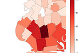
InTDS ArchivebyYaser SakkafVisualizing Map of Crime against women in India using GeopandasThis article shows us a simple way to plot either state-wise or district-wise statistical data (like the one used here i.e. crime against…Feb 18, 20201Feb 18, 20201
InLevel Up CodingbyOkan YenigünHow to Build a Marimekko Chart in PythonLet’s Create a Marimekko Chart to Visualize Our DataJul 1, 2022Jul 1, 2022
InTDS ArchivebyThomas BuryBuilding a dashboard in Plotly DashTo explore thousands of ECG recordings on PhysionetAug 31, 20222Aug 31, 20222
InGeek CulturebyArturas VycasLocation Marking with Folium in PythonDid you ever need to add markers on the map to visualize some data? Don’t worry about that anymore. It turns out that it is quite easy to…Sep 9, 20212Sep 9, 20212
Lars ter BraakBeyond traditional asset return modelling: Embracing thick tails.Guide to statistical inference for preasymptotics.Jun 21, 2022Jun 21, 2022
InTDS ArchivebyAmanda Iglesias MorenoAnalysis of car accidents in Barcelona using Pandas, Matplotlib, and FoliumOpen Data Barcelona is Barcelona´s data service which contains around 400 datasets, covering a wide rage of topics such as population…Sep 1, 201914Sep 1, 201914
InTDS ArchivebyGustavo R SantosPandas Tricks for Time Series Analysis3 functions (with code) for analyzing time series in PandasSep 21, 20221Sep 21, 20221
InTDS ArchivebyJack HuangStruggle to remember Matplotlib and Seaborn parameters? Use this lazy man’s tool.Make your learning in Python visualization less painful, more playful and sustainableAug 28, 2021Aug 28, 2021
InTDS ArchivebyLore So WhatManage your Money with PythonA Step-by-Step Guide to put you in control of your financesOct 7, 20205Oct 7, 20205
InTDS ArchivebyBenjamin SpilsburyMaking Heat Maps with Literal Maps: How to Use Python to Construct a ChloroplethHave you ever been reading a news article where, halfway down the page, you come across a beautiful graphical representation of whatever…Oct 5, 20201Oct 5, 20201
Kafaru SimiTexter: Introducing a new text analysis library in RYou’ve never seen text analysis this easyOct 4, 2021Oct 4, 2021
Edgar GarcíaPandas, Seaborn and Mapbox for Data VisualisationExploring and visualising UNESCO World Heritage Sites.Jan 30, 20221Jan 30, 20221
InTDS ArchivebyPratishArrows in python plotsAn introduction to arrows and text annotations in matplotlib plotsFeb 4, 20222Feb 4, 20222
InTowards DevbyKyle Lee DixonModern Portfolio Theory in RWhat is Modern Portfolio Theory?Jan 31, 20221Jan 31, 20221
InTDS ArchivebyAudhi AprilliantThe k-prototype as Clustering Algorithm for Mixed Data Type (Categorical and Numerical)The explanation of the theory and its application in real problemsJan 17, 20215Jan 17, 20215
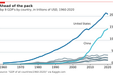
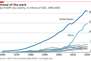
InTDS ArchivebyRobert RitzMaking Economist Style Plots in MatplotlibIf you like data visualization, chances are you’ve see charts from The Economist. Let’s make their charts in Matplotlib!Jan 26, 20222Jan 26, 20222
InAnalytics VidhyabyShivam SoliyaCustomer Segmentation using k-prototypes algorithm in PythonCluster analysis with k-prototypes algorithm of Smartwatch survey data in python.Jul 2, 2021Jul 2, 2021
InTowards AIbyAmit ChauhanFully Explained K-means Clustering with PythonUnsupervised part in machine learning for group similarities.Jan 25, 2021Jan 25, 2021